- case study
Avicenna Mobile App

Project Overview
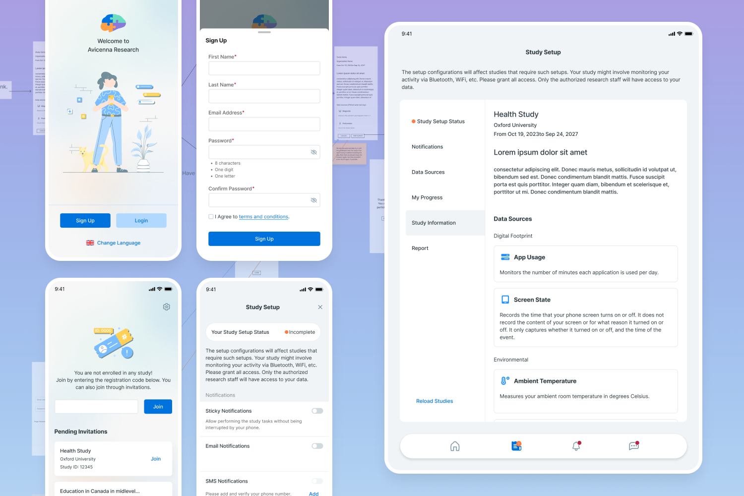
AvicennaResearch is a comprehensive research platform adhering to GCP standards. Avicenna has a mobile application for participants to check and respond to surveys or other study-related activities they are enrolled in. As the product designer, I assessed the application across different devices and its desktop version, documenting its strengths and weaknesses.
Design Challenge
How might we improve the participants’ experience without adding new features?
Responsibilities
- Lead the redesign effort
- Conduct Competitive Analysis
- Design user flows
- Design the UI/UX
Overview of the Steps: Discovery > Empathy > Design > Evaluation
Discovery
Design Challenges and Project Scope
In this phase, I aimed to understand the design challenges and project scope, identifying key stakeholders and relevant technologies.
- Interviewed developers to understand backend management and interdependencies.
- Ensured the redesign would not introduce new features.
- The redesign should include the main sections of the app, not activities, and survey UI design.
Empathy
To better understand users’ current pain points, I reviewed support tickets related to app issues and checked user comments on app stores.
Result:
- Collect feedback from marketing and support teams regarding customer concerns.
- By categorizing and clustering related insights, the affinity diagram served as a visual representation of key findings.
- Conducted competitor analysis and mapped the current app flow.
Insights from the Empathy Phase:
- The primary issue was app speed.
- Difficulties were observed in the joining process.
- The UI design was not appealing, leading to the loss of a contract with a famous organization targeting teenagers.
Ideation
To kickstart the ideation phase for redesigning the flow, I took the following steps:
- Revisited my competitive analysis and reviewed app designs.
- Sketched my ideas on tablet using the Crazy 8 method.
- Selected promising ideas and added details to present to the team during our weekly meetings.
- Explored various methods for study enrollment and designed a streamlined flow.

Review and Refinement
- Held a review and brainstorming meeting with the CEO, marketing, and development teams.
- Revised sketches based on feedback from the meeting.
- Designed high-fidelity wireframes reflecting the refined concept.
- Presented the wireframes to the CEO and product team for final approval.


UI Design
Started detailed designing in Figma.
[designs]
Results and Impact
- Created a prototype in Figma and shared the link with my teammates, resulting in a 90% satisfaction rate.
- Also shared a document with all other teams for additional ideas, which contributed to further enhancing the design.


