- case study
Case Study of Criteria
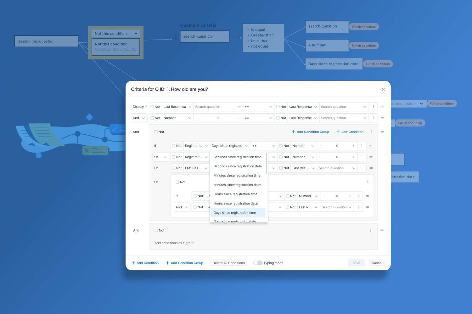
Introduction:
This case study showcases my work on AvicennaResearch, where I redesigned the Criteria feature to enhance user experience. It highlights the process from discovery to final implementation, demonstrating a commitment to creating impactful, user-friendly designs.
Project Overview
AvicennaResearch is a comprehensive research platform adhering to GCP standards. As a product designer, I assessed the system’s functionality and documented its strengths and weaknesses.
The platform has two primary features for survey creation: Criteria and Triggering Logic (TL). Researchers use these features to design their studies, but both were not user-friendly. Creating a Criteria required checking multiple items, such as the study ID, across different pages. Criteria are conditional expressions or formulas that determine whether an action should occur. TL specifies when an activity should be prompted to the participant. Researchers had to use operands to add Criteria. Using the Effort-Impact scale, I prioritized redesigning the Criteria, followed by the Filter box, which aligned with the new Criteria concept, and then TL. Below is the process for redesigning the Criteria.
User Groups
- Academic research labs & university hospitals.
- Non-profit research institutions
- Government organizations
- Contract research organizations (CRO)
- Pharmaceutical companies
design challenge
How might we improve the researchers’ experience by enhancing the Criteria feature?
Responsibilities
- Lead the redesign
- Conduct early market research
- Create and manage the roadmap
- Design user flows and UX
- Design the UI of the feature based on the design system
Team
- CEO: Provided deep system knowledge during meetings
- Marketing specialists
- Back-end and Front-end developers: Participated in interviews and meetings
- Me: UX Designer
Constraints
- Ensure the redesign does not impact the back-end functionality.
- Focus solely on redesigning the Criteria feature without affecting other areas.
- Maintain awareness of how this redesign interacts with other system parts and data links.
- Note that I did not have access to end-users during this process.
Overview of the steps:
Discovery >Empathy > design > Evaluation
Discovery:
Design Challenges and Project Scope
In this phase, I aimed to understand the design challenges and project scope, identifying key stakeholders and relevant technologies.
- Reviewed documentation related to the Criteria feature.
- Interviewed developers to understand back-end management and interdependencies.
- Ensured the redesign would only impact the Criteria feature, not other parts of the system.
- Initially considered redesigning both Criteria and TL, but narrowed the scope to Criteria based on the Effort-Impact scale.
Empathy:
To better understand users’ current experience, I created an As-Is scenario map, outlined the current flow of adding Criteria, and interviewed support and marketing teams.
Questions:
- What are the critical business challenges that we will focus on?
- What are the barriers and constraints in our way?
- What are our future opportunities?
- What are the key success metrics?
- What is their primary goal?
- What are some of the biggest challenges they face?
- Within the current scope, what are their pain points? (What is holding them back from getting the job done?)
- What annoys them about the experience?
- What are the users’ jobs to be done? (User 1: AvicennaResearch for customer attraction, User 2: researchers, User 3: participants)
- What are the expected gains? (What are the positive outcomes if we solve this challenge?)
- What delights them? How can we enhance it?
Result:
- I compiled feedback from marketing and support teams regarding customer concerns.
- Reviewed support emails and product forums to document Criteria-related issues for consideration during the redesign. Additionally, utilized this data as evidence to persuade the CEO.
- Conducted competitor analysis, creating a mood board and jotting down notes for reference
As-ease Scenario mapping

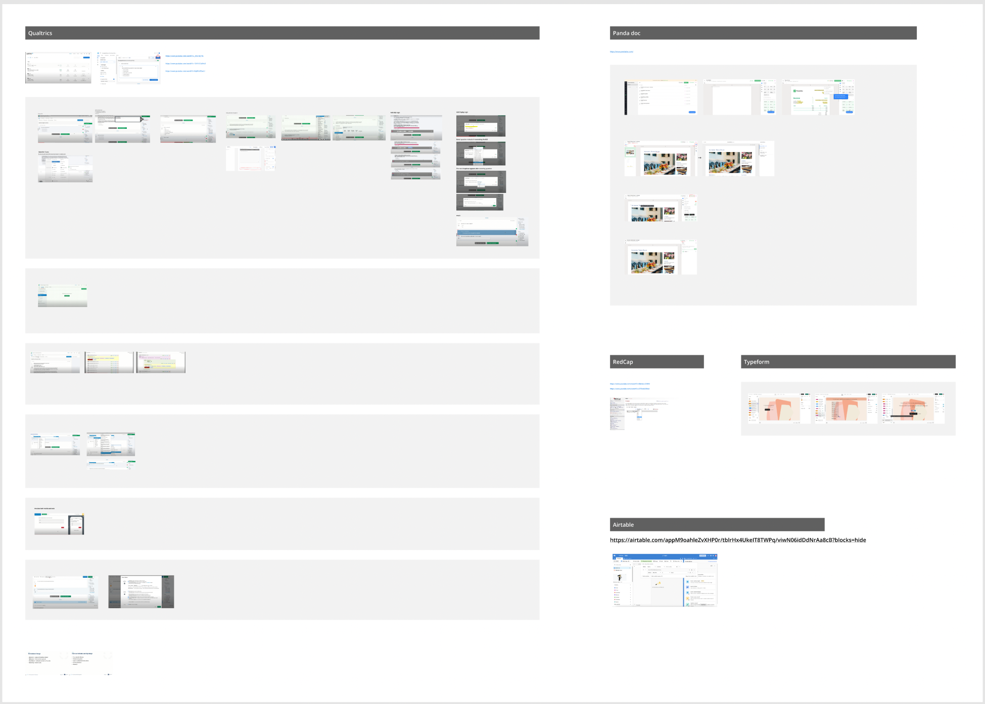
Insights from Scenario Mapping and Interviewing with the Marketing Team:
- Persona’s 3 top pain points on Criteria:
- Researchers, including expert users, perceive certain Criteria elements as programming tasks.
- Recurrent need to recall study ID and Question ID leads to back-and-forth navigation.
- Dependency on AvicennaResearch help documentation to identify eligible Criteria conditions.
- Tasks persona needs to accomplish:
- Open their study document.
- Insert study details on AvicennaResearch platform.
- Utilize Criteria to establish relationships between questions and apply conditions.
- Frequently reference AvicennaResearch help documentation
The personas’ primary goals:
- Require a feature facilitating survey flow management and condition application.
Ideation
To kickstart the ideation phase for redesigning the flow, I took the following steps:
Considered Eligible Criteria: Explored all types of criteria eligible within the system to understand the scope of possibilities.
Noted Backend Activity and Competitor Ideas: Kept track of backend developments and gathered insights from competitor strategies.
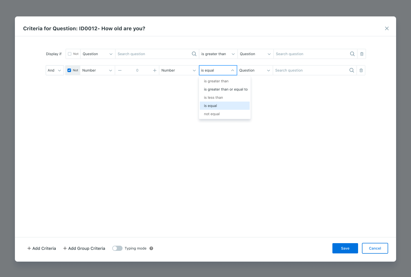
Exploring User-Friendly Solutions: Explored a solution wherein the flow of creating conditions resembles natural language, aligning with researchers’ preferences. For instance, instead of using operands, I envisioned a flow where researchers could create conditions in a more intuitive manner. For example, “Q12345_2 == Q4” would signify that the answer to Question 2 of survey 12345 be equal to the answer of question 4. I was thinking creating a way to show the question text/ label
Validating New Ideas: To validate the feasibility of this new approach, I began drafting eligible criteria based on the proposed concept, ensuring its functionality and usability.
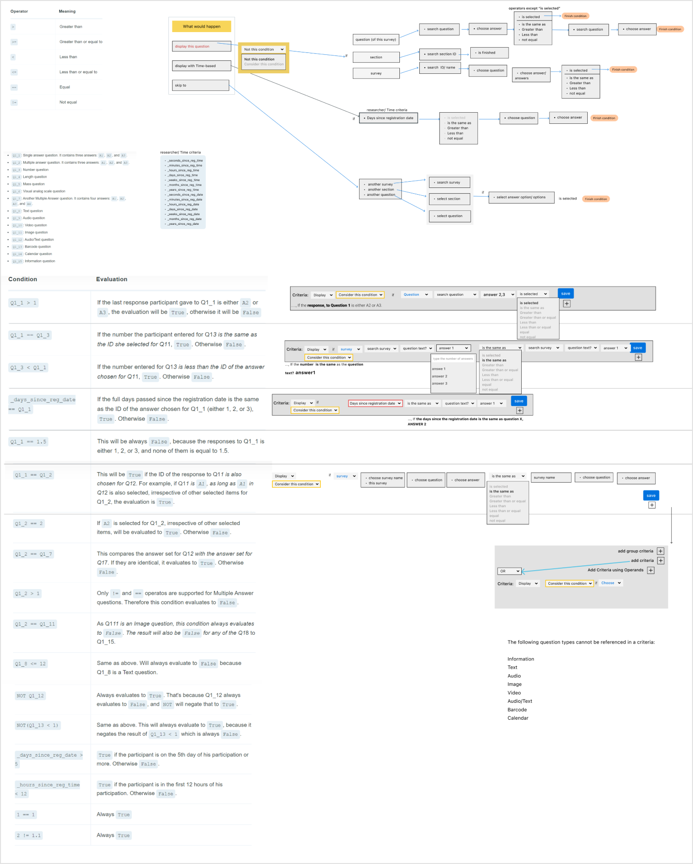
First version of the low-fid wireframe of my idea to handle conditions
Review and Refinement:
- Brainstorming Session: Conducted a review and brainstorming meeting with the CEO, marketing, and development teams.
- Concept Revision: Revised the concept based on feedback from the meeting.
- High-Fidelity Wireframes: Designed high-fidelity wireframes reflecting the revised concept.
- Final Review: Presented the wireframes to the CEO for final confirmation.
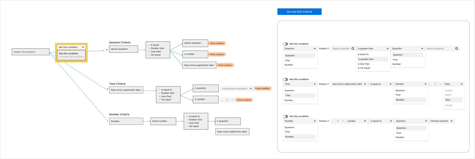
UI Design
- Start Detail design based on components in Figma. You can check more frames in this Figma file.
Results and Impact:
The redesigned Criteria feature significantly improved the user experience for researchers using AvicennaResearch. Key outcomes included:
Increased Efficiency: Researchers could create and manage Criteria more quickly, reducing the time spent navigating and cross-referencing study IDs and Question IDs.
Positive Feedback: Initial user feedback highlighted the improved ease of use and decreased dependency on help documentation.
Reduced Support Requests: There was a noticeable drop in support requests related to Criteria, indicating that the redesign effectively addressed common pain points.
Appendix:
You can learn about Criteria in Avicenna Learn.